
freelance client work @ Loft121 | Jan - Mar 2024
Gallery Website: Exploring the Intersection Between Art and Usability
Description
To address the reason behind the website’s questionably high drop-off rate, we aimed to pinpoint user pain points that may have contributed to the phenomenon and to enhance the overall website experience, both visually and functionally. Especially with repetitive inquiries regarding ongoing exhibitions that can be answered through the information on the website, the stakeholders would like to identify and resolve potential issues with the website.
Team
1 Product Designer
1 Developer
2 Executives
My Role
Product designer
Tools
Adobe Photoshop
Figma
Miro
user interviews
graphic design
heuristic analysis
mid-fi prototype
usability testing
hi-fi prototypes
HTML/CSS
About Loft121
Loft121 is a pop-up curatorial project based in New York City. Through its mindful curation, Loft121 hopes to serve as a platform for storytelling and experimentation for artists, and provide an environment for artistic exploration, dialogue and development for all visitors.

Project Goal:
Refine the user experience to reduce initial drop off rates and visually redefine the platform to provide an effortless, gallery-like experience
Getting the inside scoop
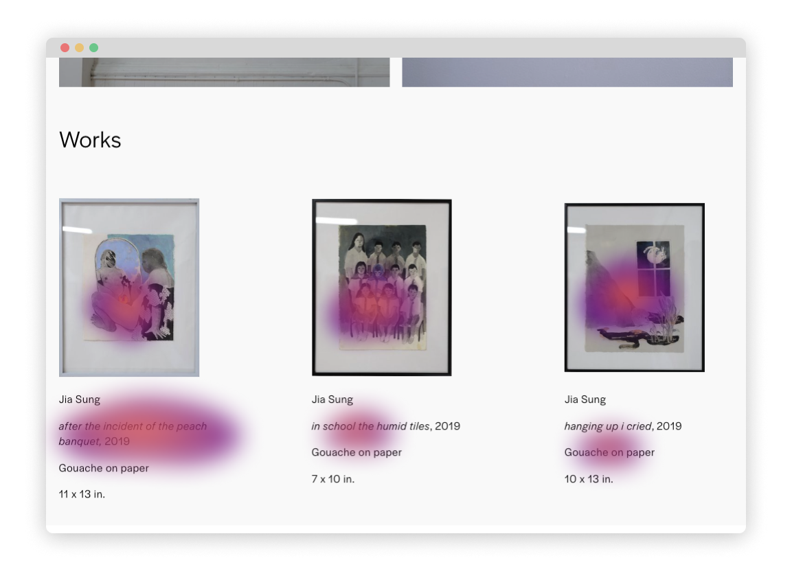
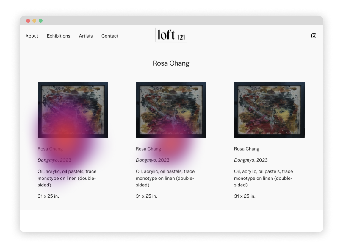
To start off, we initiated the research by evaluating the current designs' heuristics, conducting user interviews, and performing usability audits. This allowed us to discover the inside scoop among current users regarding the existing website and comprehend the reasons behind its high drop-off rates.
01
Heuristic Evaluation
02
Usability Audit

03
User Interview Affinity Map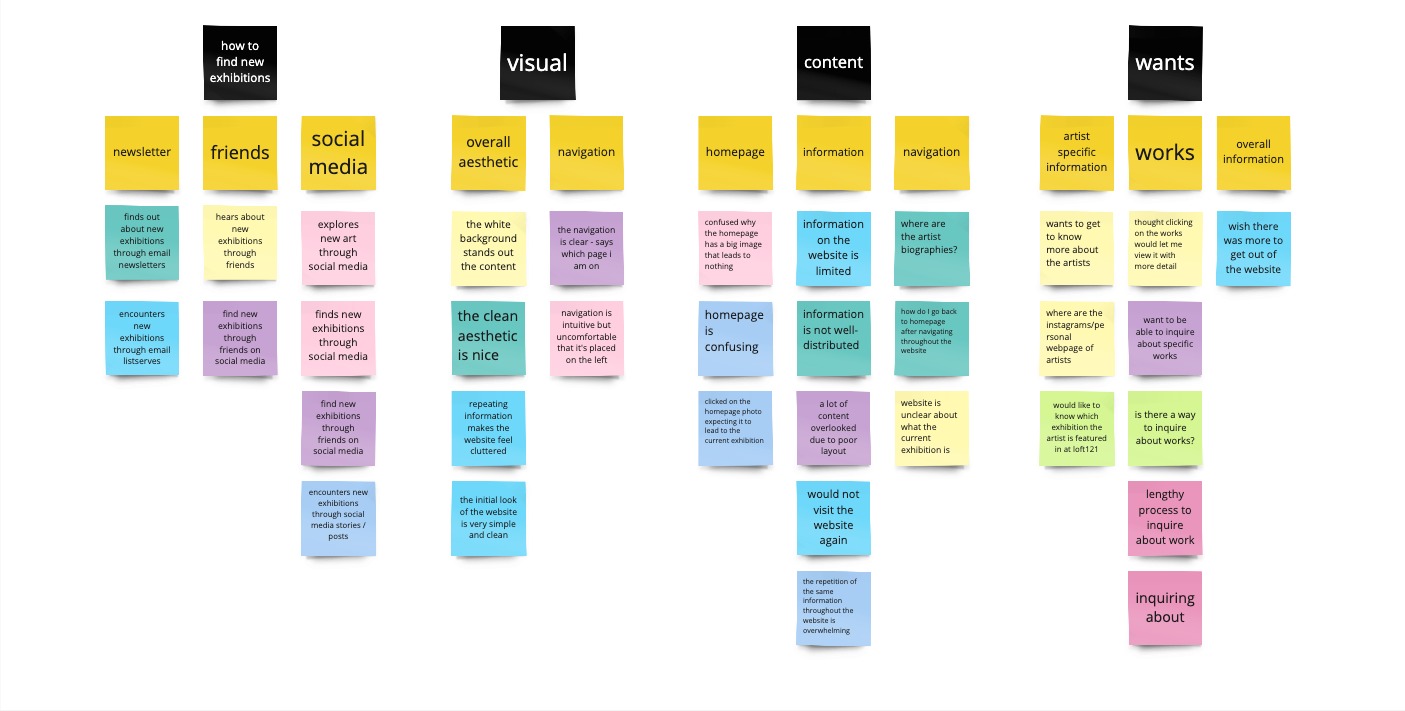
Extra bits from stakeholers
Stakeholders shared with us the issues they are facing with the platform for us to incorporate when reworking the website:
✧ The current website feels cluttered and inefficient
✧ The visual design is not a good representation of Loft121’s values
✧ Not enough users send inquiry through the website
✧ The current website feels cluttered and inefficient
✧ The visual design is not a good representation of Loft121’s values
✧ Not enough users send inquiry through the website

Our Discoveries
Opening our eyes to capture more detail
To further understand and empathise with users and their pain points, we mapped out users’ change of emotions throughout their journey on the existing Loft121 website, annotating points of intervention along with potential solutions. Our end-goal for this project is to enhance user engagement as they explore the website and bring up users’ emotions to the green dotted line.

The Loft121 website aligns with user needs, but...
From the user interviews, we suprisingly found out that the Loft121 website actually did provide all the information and qualities users were seeking for on the platform. The website, however, did not present such information with users in mind, ultimately creating frustrations for users when they could not find the expected information in the expected areas of the website.
Painpoints
As noted with the venn diagram above, the website contains all the information that users are seeking to find in the website, but because the website is not user-centric, it fell short of meeting usability expectations. The following are two pain points discovered during heuristic evaluation and usability audit that gave us insight behind the high drop-off rate for the Loft121 website.

Design Exploration Journey
Exploration
Having nailed down user painpoints, we ideated and tested numerous design iterations to discover the best usability.

Fine-tuning
While the final design addresses various design issues, we have analyzed the three most pressing design problems directly related to the three user pain points in detail.
01
Main Nav Bar
Design problem
The main navigation bar, which is the user’s first encounter with links on the website, does not have any link indicator, which in turn caused the users to randomly click around looking for links hoping that it would lead to pages they expect to get to
The main navigation bar, which is the user’s first encounter with links on the website, does not have any link indicator, which in turn caused the users to randomly click around looking for links hoping that it would lead to pages they expect to get to

Design solution
Implement prominent link indicators on the main navigation bar
Implement prominent link indicators on the main navigation bar

Design rationale
The new iteration will provide error prevention, increasing visibility of links and seamlessly differentiating links from regular test throughout the website.
The new iteration will provide error prevention, increasing visibility of links and seamlessly differentiating links from regular test throughout the website.
02
Local Navigation Bar

Design problem
The current structure Loft121’s website pages, where all the information are stacked in an unorderly manner, leaves no options for the users but to have to scavange throughout the website for the information they wish to obtain from the website
The current structure Loft121’s website pages, where all the information are stacked in an unorderly manner, leaves no options for the users but to have to scavange throughout the website for the information they wish to obtain from the website

Design solution
Create an additional navigation bar for every page that would benefit from it
Create an additional navigation bar for every page that would benefit from it

Design rationale
Done with card sortting, this solution will efficiently and effectively guide users to obtain the information they are looking for.
Done with card sortting, this solution will efficiently and effectively guide users to obtain the information they are looking for.
03
Pop-up Images
Design problem
Users’ main interest in the site is the aritsts’ works, yet they struggle to be able to see the works clearly
Users’ main interest in the site is the aritsts’ works, yet they struggle to be able to see the works clearly

Design solution
Implement a new pop-up feature that allows users to see individual works more clearly
Implement a new pop-up feature that allows users to see individual works more clearly

Design rationale
Inspired by the additional third-party research, this new feature will allow users to enjoy and appreciate each works, bringing the platform one step closer to an improved design system. Upon user research, we decided that iteration 2 with the work detail would be better, as users had to go back and forth from the enlarged image pop-up to refer to the work information.
Inspired by the additional third-party research, this new feature will allow users to enjoy and appreciate each works, bringing the platform one step closer to an improved design system. Upon user research, we decided that iteration 2 with the work detail would be better, as users had to go back and forth from the enlarged image pop-up to refer to the work information.
Design Systems
Visual Guideline
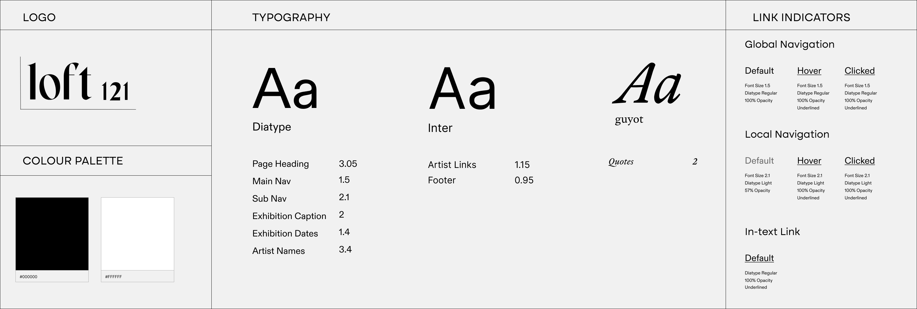
A visual guideline was created to ensure that current and future design choices are holistically aligned with Loft121’s values, preventing unaligned design or interaction choices from compromising the platform's visual representation and addressing recurring pain points.
Site Map
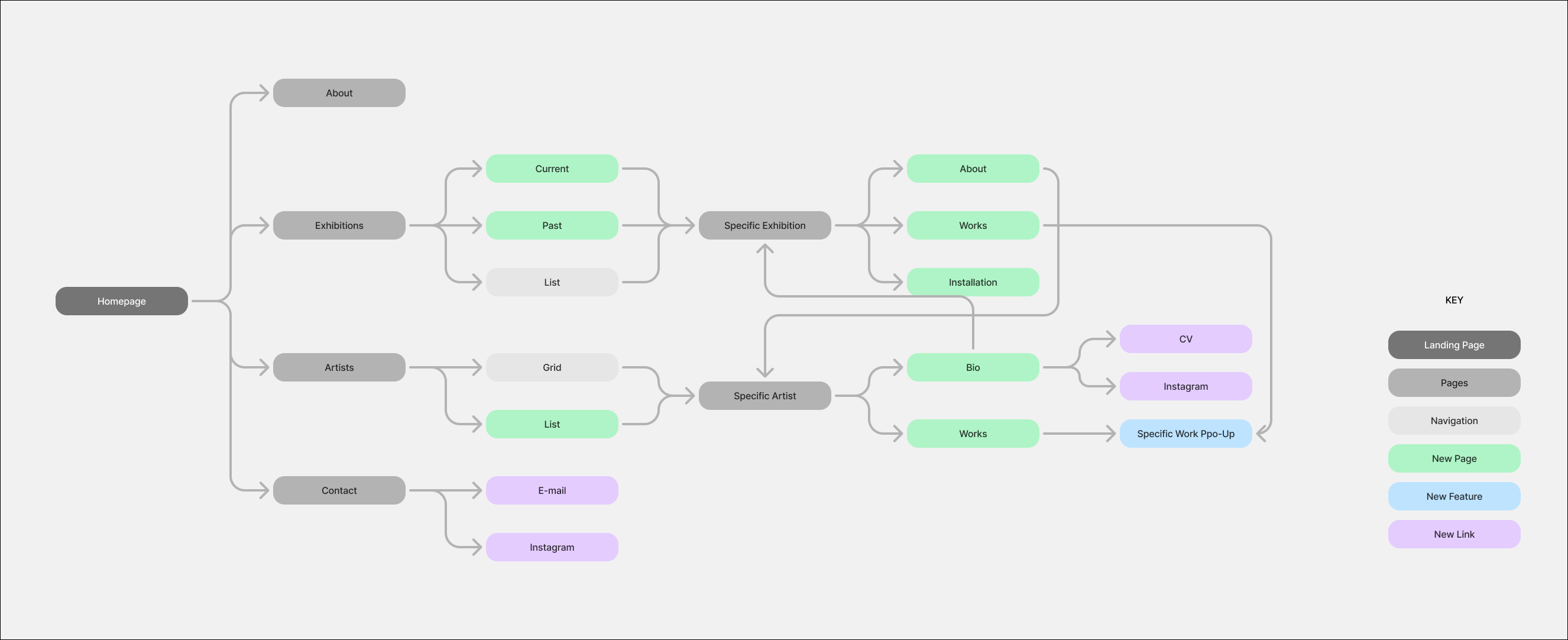
The sitemap below organizes the order and relationships between the many pages of the website, providing a broader perspective on its structure. It was created to help maintain organization and will be useful for implementing new pages in the future.
Optimising Mobile Usability
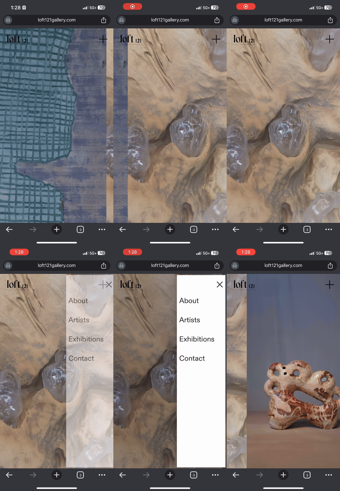
Our research showed that 86% of new users experience the Loft121 website from their mobile devices via the company’s Instagram. The following are the main tweaks I made on the mobile page design to optimise the mobile usability for users.
Homepage + Nav Bar
✦ Fold out local navigation for cleaner presentation
✦ Homepage image slideshow of works in the current exhibition
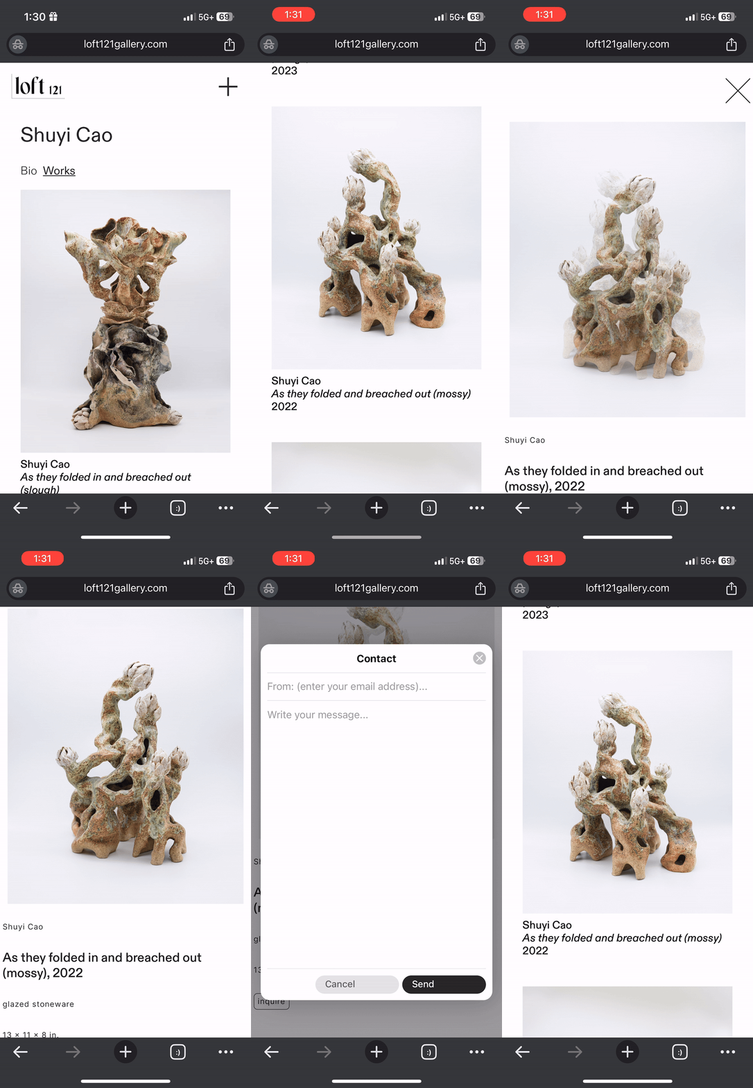
Grid + Individual Image View
✦ Single column instead of three columns on web
✦ Stack view for individual image pop-up instead of two columns on web
✦ Large X button to exit out of individual image pop-up
The Final Solution.
The following is a breakdown of the final design solution for Loft121.
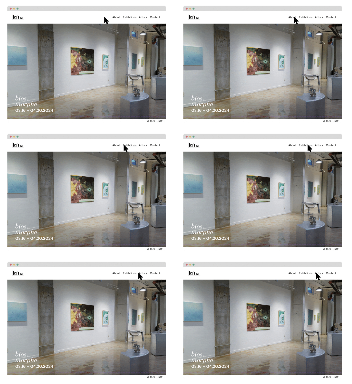
Global Navigation
✦ right aligned to accomodate what users preferences
During interviews, users found left-aligned navigation awkward and uncomfortable.
✦ underlined on hover to set the user expectation straight
Previously, the absence of indicators led users to assume links were intuitive. The underline now signals that every link is indicated.
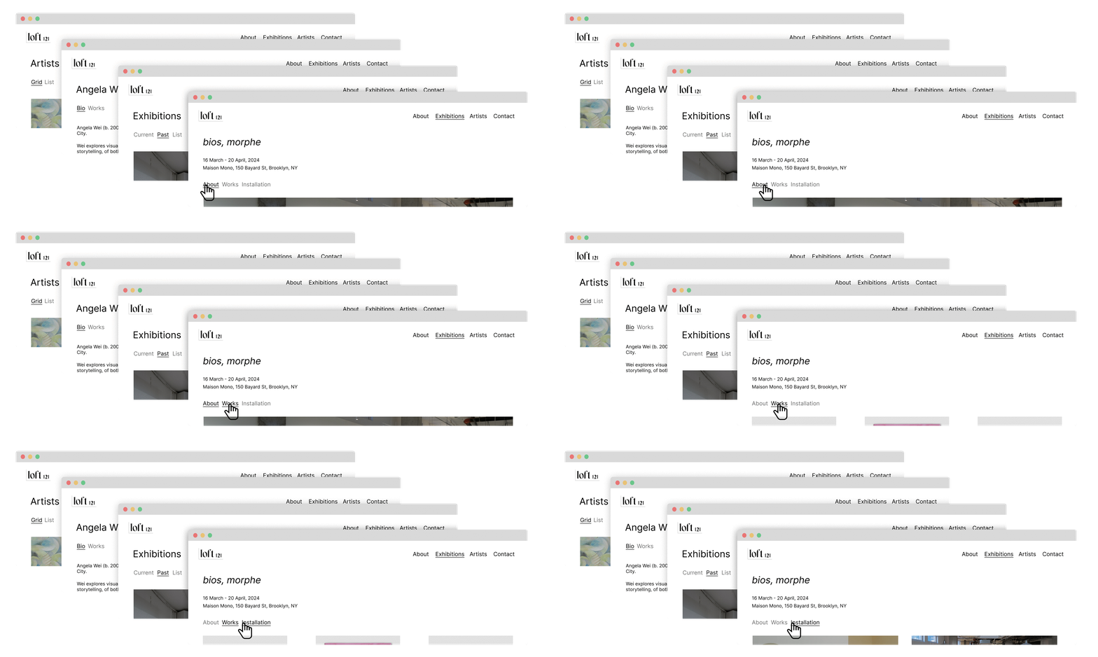
Local Navigation
✦ Categorises lengthy information for clarity
✦ Presents information in an approachable and accessible way
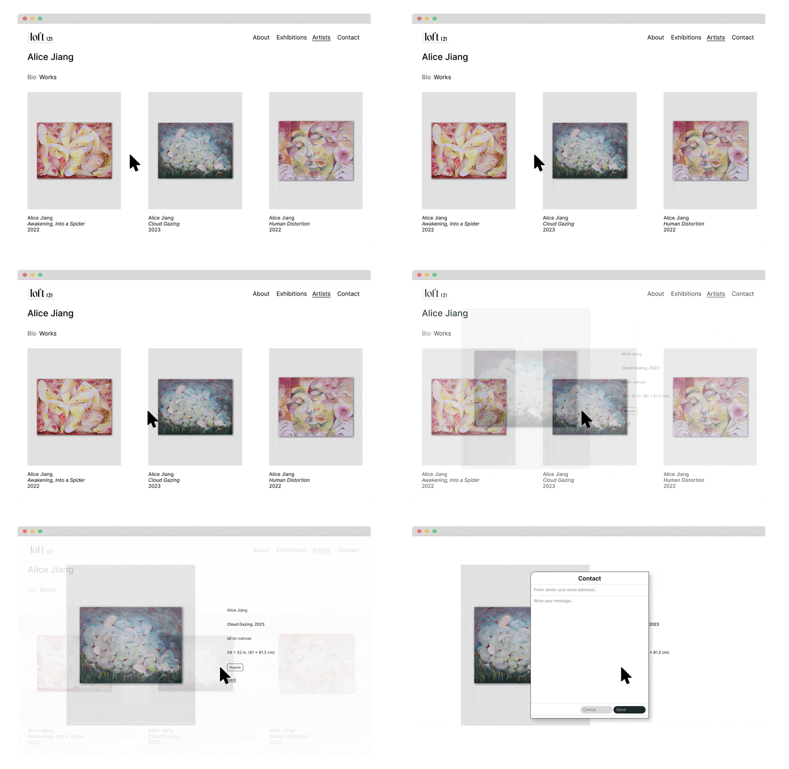
Pop-up Image
✦ Intuitively available on-click for all individual works
✦ Inquiry form available under each works’ details
✦ Varying angles of the work provided when necessary

Streamlined Link Indicators
✦ Underlines are used to explicitly and intentionally for links within text
Unlike hover indicators in navigation, these underlines ensure clarity for users.
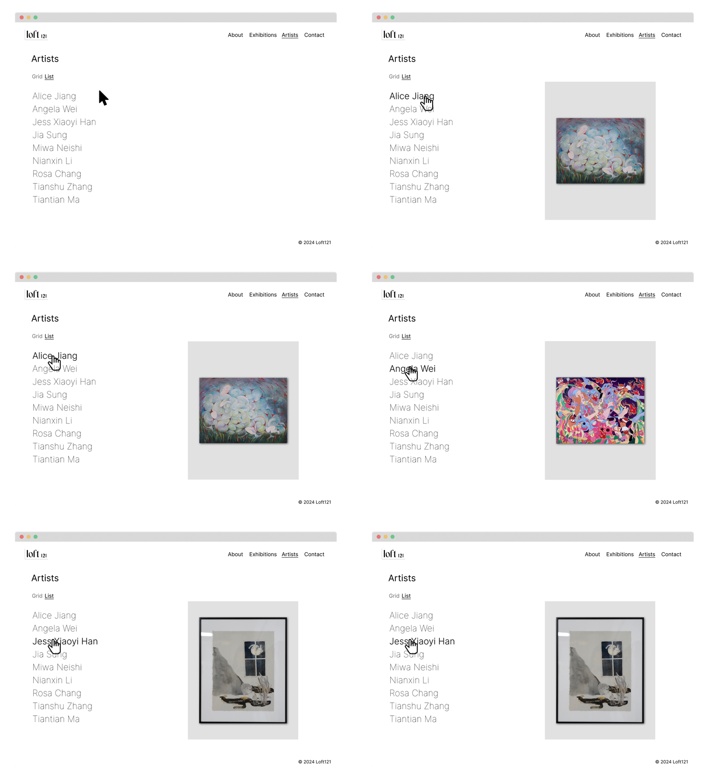
Aesthetics Meets Usability
✦ Grid option for users that wish to discover new artists.
The three-column square image grid offers a gallery-like experience, with each artist represented by their artwork.
✦ List option for users seeking a specific artist.
The list is both efficient and engaging,w ith hover artwork helping users remember artists while effectively using extra white space.

User Impact
the impact was assessed using data from user interviews with 10 participants, a survey of 15 users, and Google Analytics, over a two-month period following the implementation of the new design solution

Closing Thoughts
Learning Outcomes
✦ The importance of attention to detail; every element can influence user decisions
✦ Identifying effective user research methods to gain a deeper understanding of the user
✦ Communicating the client’s values through visual elements and interactions
✦ Successfully balancing aesthetic details with user needs
✦ Achieving precise mobile optimisation through HTML and CSS coding
✦ Identifying effective user research methods to gain a deeper understanding of the user
✦ Communicating the client’s values through visual elements and interactions
✦ Successfully balancing aesthetic details with user needs
✦ Achieving precise mobile optimisation through HTML and CSS coding
Moving Forward...
✦ Continue tracking analytics, making changes accordingly, and testing
✦ Implement Press page
✦ Regularly update individual artist pages to avoid broken links
✦ Conduct user interiews on the mobile platform
✦ Implement Press page
✦ Regularly update individual artist pages to avoid broken links
✦ Conduct user interiews on the mobile platform
🙌 you’ve made it to the end 🙌
return home
return home
