summer internship @ OrderCheck | Jun - Aug 2022
Administrator Portal: Redefine & Redesign



Description
To support OrderCheck's rapid growth, administrators needed an efficient way to manage users and track behavior. As the lead designer, I conceived and executed the redesign of the administrator portal.
Team
2 Product Designers
1 COO
3 Developers
My Role
Lead Designer
Tools
Procreate
Figma
User Research
Prototyping
About OrderCheck
OrderCheck, a B2B SaaS startup from South Korea, offers customer management and interior component ordering services for interior design companies. Focusing on the interior remodeling market, the company is growing at 25-30% per month. OrderCheck provides five key features: an online consultation request form builder, client management, file storage, text messaging, and company management tools. These features allow companies to efficiently manage communications and data. Subscription plans, which vary by storage capacity and the number of manageable consultation requests, cater to different business needs.
Current Platform
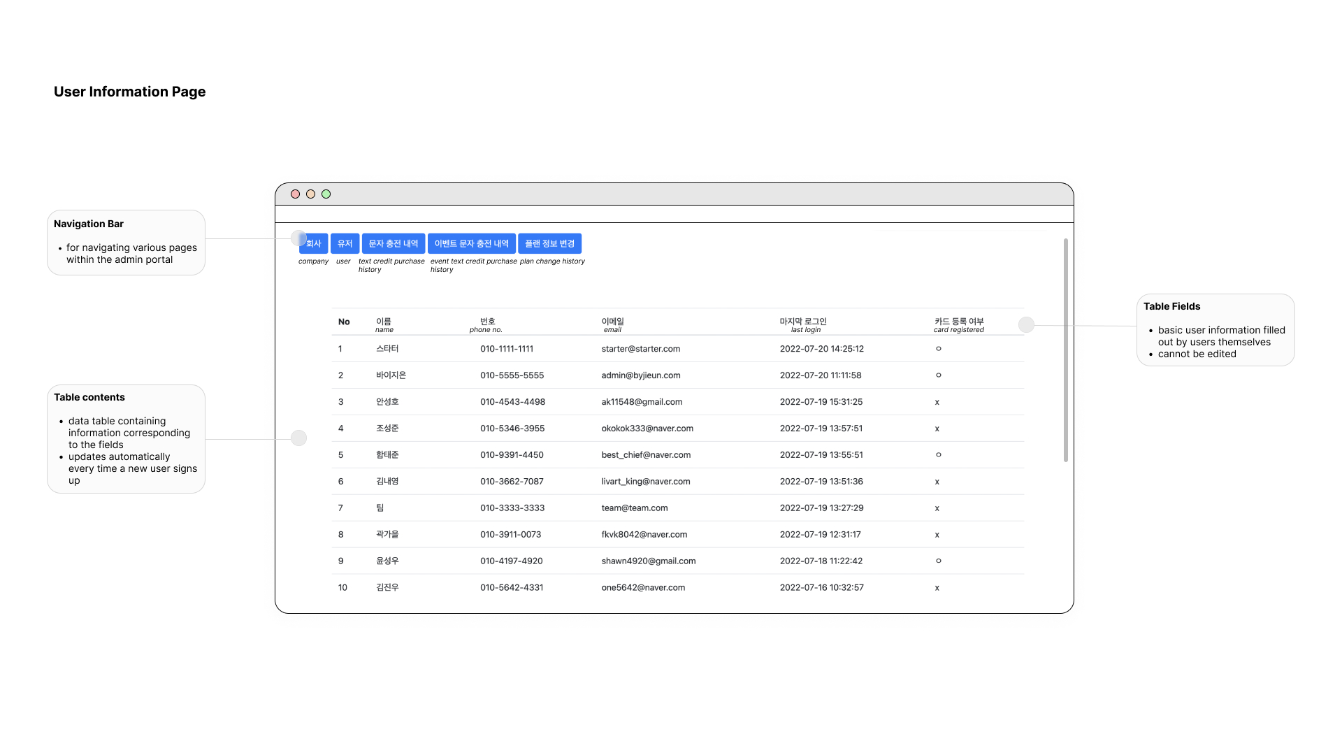
The current admin portal has a raw user interface consisting
of a navigation bar and two active pages: company page and user page. Both
pages have a simple data table with appropriate information pertaining to the
page. Other pages in the navigation are inactive. 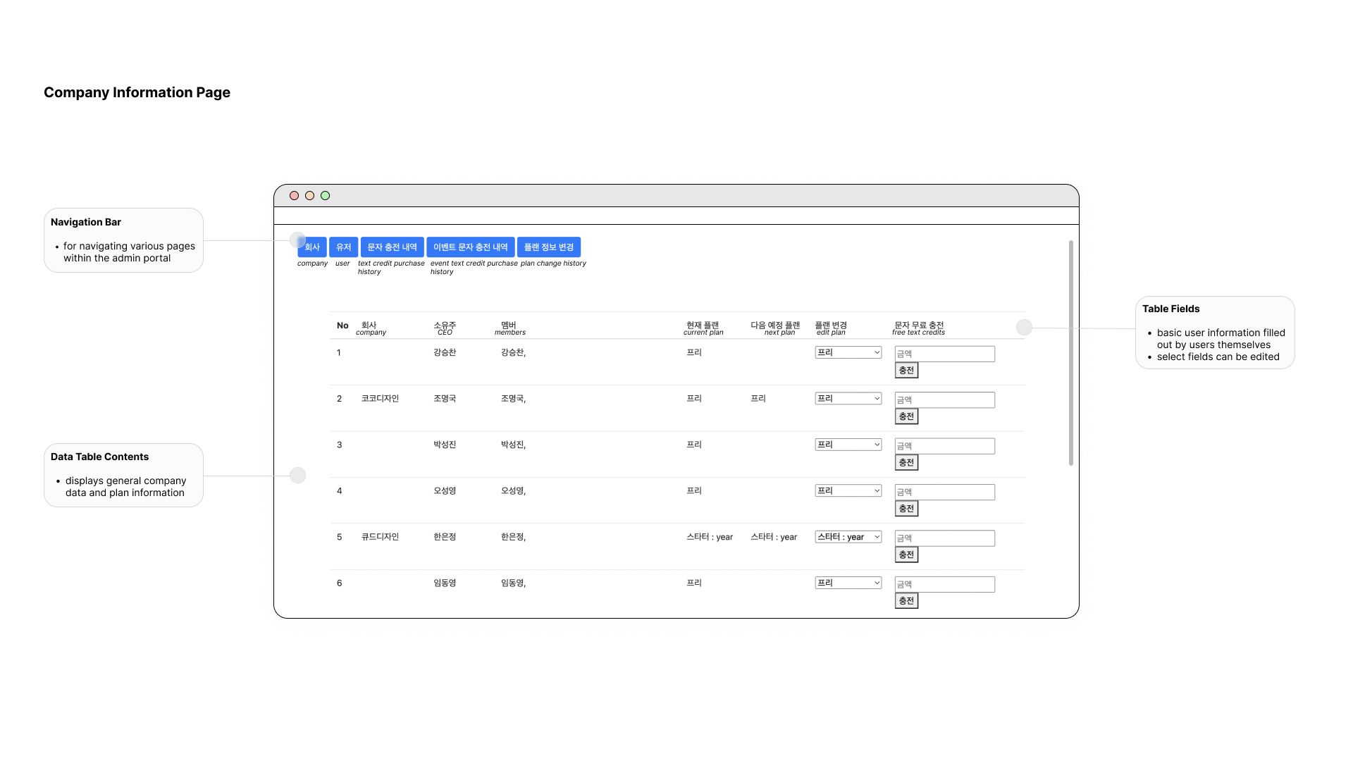
Business Problems
While the admin portal operates independently from OrderCheck as a product, it remains a crucial component of the company's operations. It's essential to thoroughly understand the challenges stemming from the portal's limitations. Following discussions with stakeholders, we identified two primary business issues requiring attention.
The platform is not being utilised to its fullest potential
The current admin portal is largely unused by employees, as the only working features are the company and non-editable user pages. For user data changes, employees contact developers directly, rendering the portal nearly obsolete.
The current admin portal is largely unused by employees, as the only working features are the company and non-editable user pages. For user data changes, employees contact developers directly, rendering the portal nearly obsolete.
OrderCheck has to keep track of its growth and user behaviour manually and using third-party analytics platform
The current platform lacks essential admin functions and a crucial feature for stakeholders: analytics. Relying on a third-party platform and manual tracking is costly, inconvenient, and less reliable compared to having an integrated internal metrics system on the admin portal.
The current platform lacks essential admin functions and a crucial feature for stakeholders: analytics. Relying on a third-party platform and manual tracking is costly, inconvenient, and less reliable compared to having an integrated internal metrics system on the admin portal.
Getting to know the users...
With the goal of analysing the user experience of the current platform and ultimately pinpointing the user problems, I collected 5 anonymous survey responses and recruited 2 developers and 2 business analysts from OrderCheck for one-on-one interviews.
“
I never use the admin portal. I don’t see the need for it.- User A
There are quite a few instances where I have to use the admin portal when I am receiving customer support requests, but no matter how many times I use it, I always end up lost while navigating through the portal.- User B
I just go directly to the developers to find me the information I need because it is more efficient that way.- User C
The information provided in the admin portal is very basic. Sometimes, we need user/company specific information for monitoring purposes, but that is not provided. - User D
”
”
Current Experiences
Based on survey and interview responses, we identified 3 key user problems experienced by target users at OrderCheck:
Disorganised and cluttered user and client company data
The data tables lack organization, with unnecessary information and confusing columns. Employees expressed frustration during interviews due to partially empty and poorly arranged columns, with no clear indication of organization. Users have to go through extensive measures in order to fix incorrect information.
The data tables lack organization, with unnecessary information and confusing columns. Employees expressed frustration during interviews due to partially empty and poorly arranged columns, with no clear indication of organization. Users have to go through extensive measures in order to fix incorrect information.
Confusing navigation within the portal
The portal's navigation structure poses numerous challenges. The navigation bar does not indicate which page the user is on, and there is no page title either. Non-functional navigation links further compound the confusion.
The portal's navigation structure poses numerous challenges. The navigation bar does not indicate which page the user is on, and there is no page title either. Non-functional navigation links further compound the confusion.
Lack of information
Pages lack essential user and company information, featuring mainly contact details with no insights into anything further.
Pages lack essential user and company information, featuring mainly contact details with no insights into anything further.
Onto making improvements
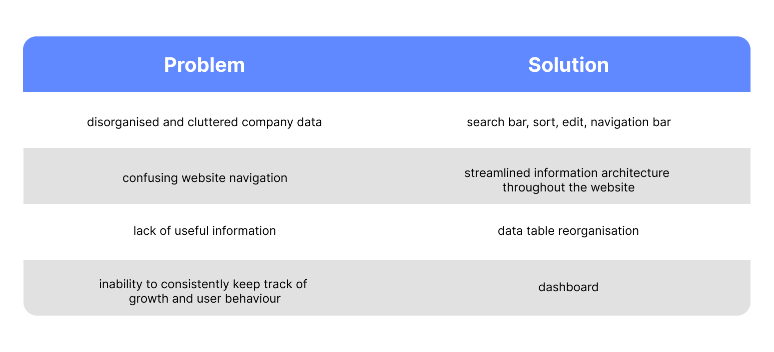
Having gathered our research and synthesized the data, we revisited the pain points and brainstormed strategies to address them for our users, while also tackling business challenges:
Iterations and Exploration Journey
![]()
Preliminary ideation
We immediately engaged in multiple rounds of rapid ideation, focusing on identified pain points, to devise solutions for the intervention points we aimed to address.

![]()
Collaborative brainstorming
Following the initial design sketches, we collaborated with the COO and CEO to identify the specific components required for each page using data collected during the research stage.
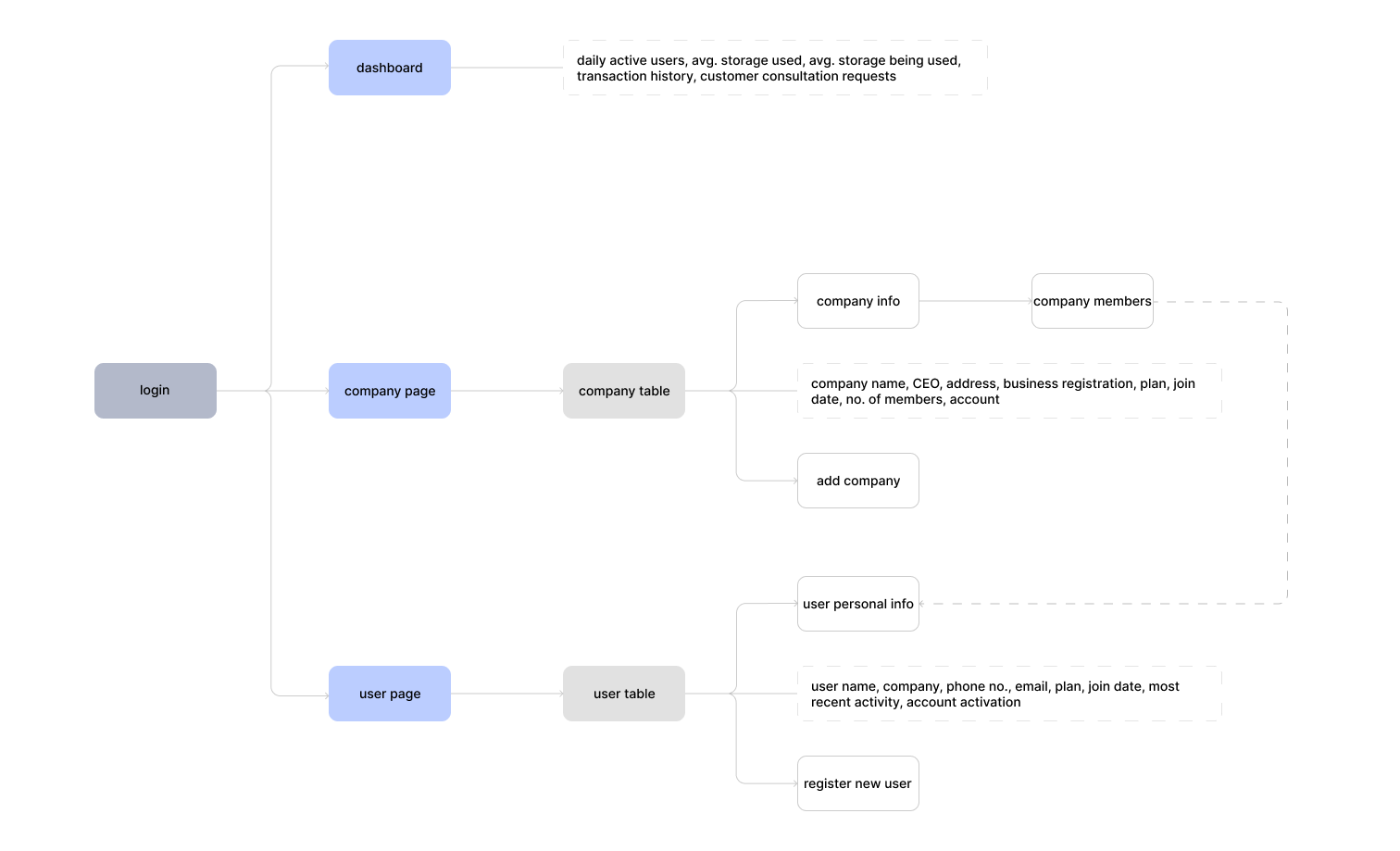
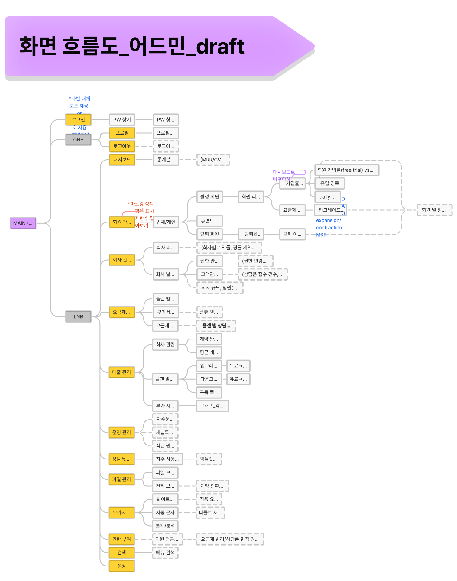
Reworking the flow: Old vs. New
The slideshow juxtaposes the current and revised user flow diagrams. We worked closely with the COO and developers to meticulously review every aspect of the existing diagram and refine it into a practical and efficient framework for the admin platform.
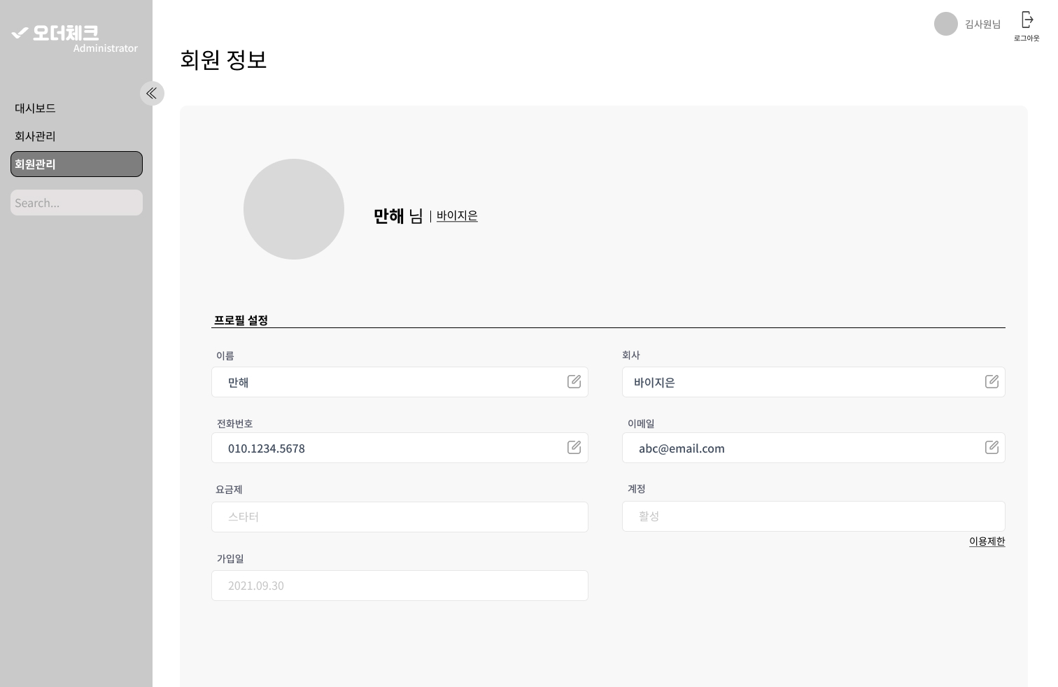
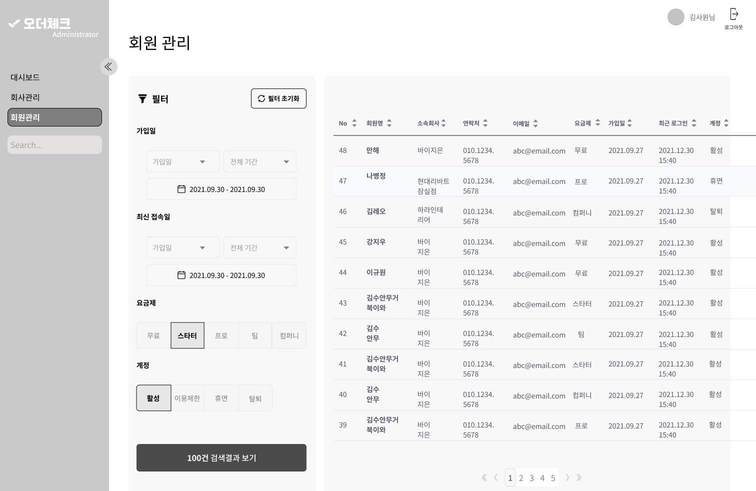
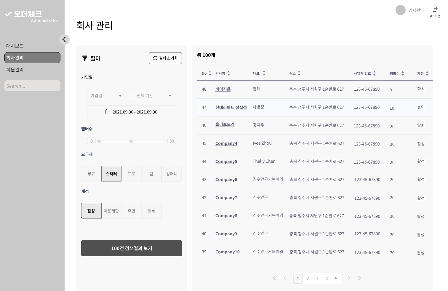
![]()
Piecing it together
Upon concluding the refinement of component details, including filters, data table columns, dashboard KPIs, and specific page layouts, we proceeded to create mid-fidelity wireframes. Subsequently, we conducted usability tests to further refine and enhance the user experience.
Visual Guideline
In spite of instilling the importance of information organization internally, we created a visual guideline. This will provide a clear framework for managing data, ensuring consistency and improving efficiency and collaboration across the team.

Final Design
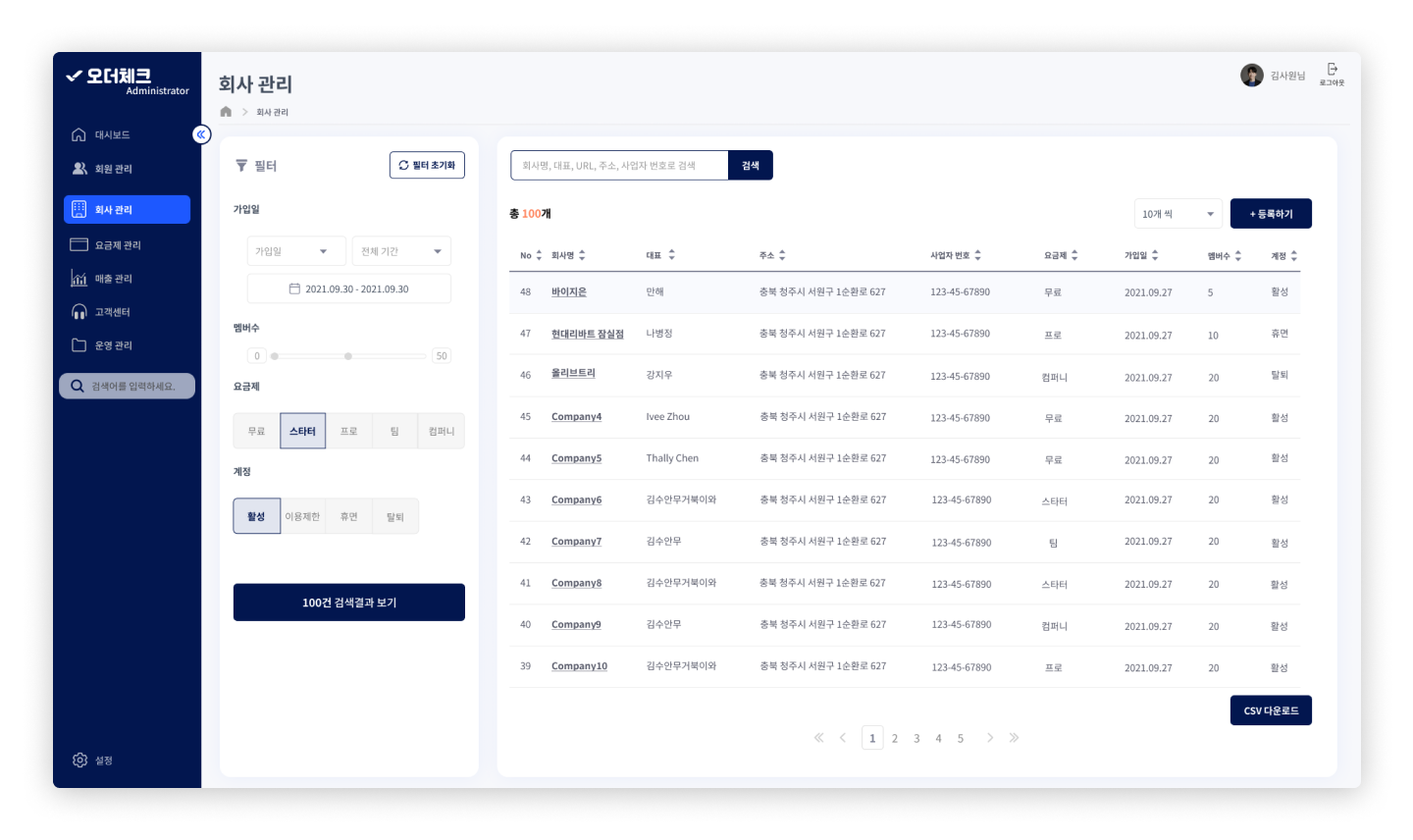
Organised Useful Data
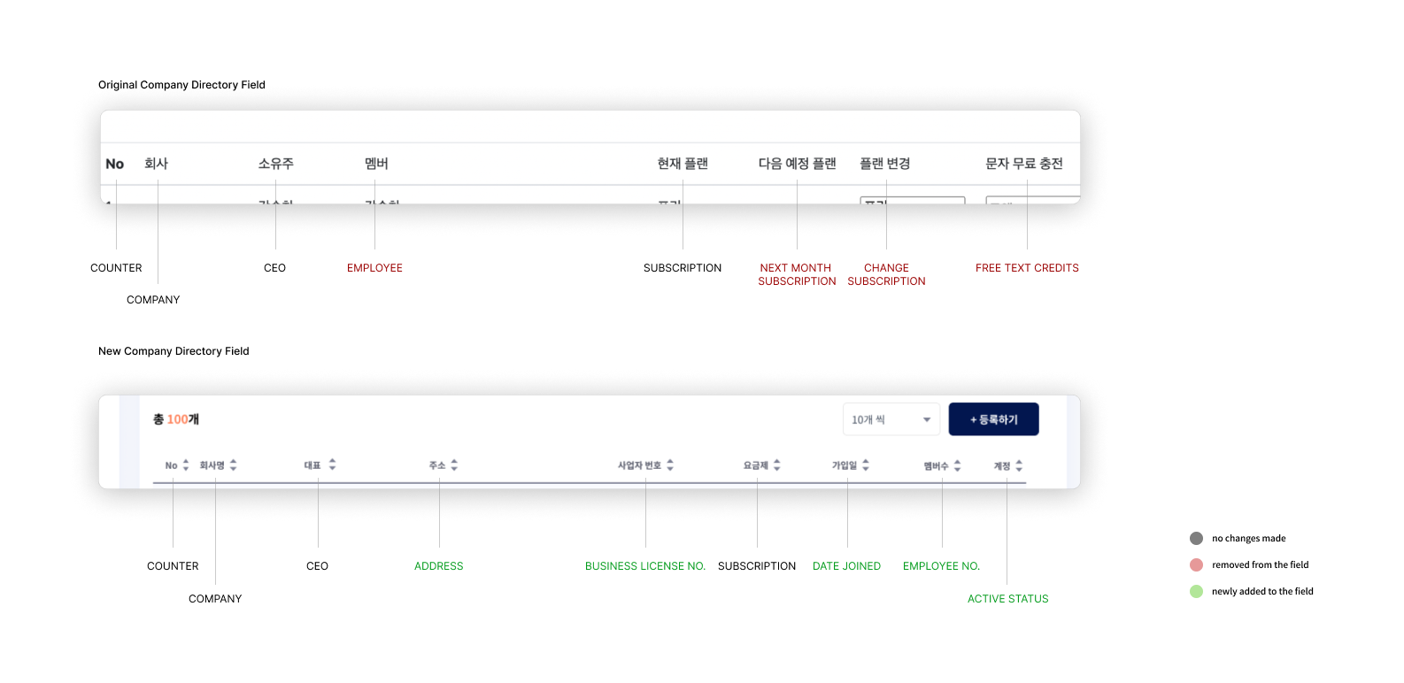
There were many overlapping opinions voiced regarding the incompetency of the data tables, which were primary components of the existing admin portal. The table setup was difficult to read and filled with unnecessary information regarding OrderCheck users. After countless design iterations and interviews, we attempted to address all the usability issues associated with the directory pages.
01
New Look and Features٭ search bar
٭ clean layout
٭ row darkens on hover
٭ CSV download
٭ add item button
٭ clickable table items

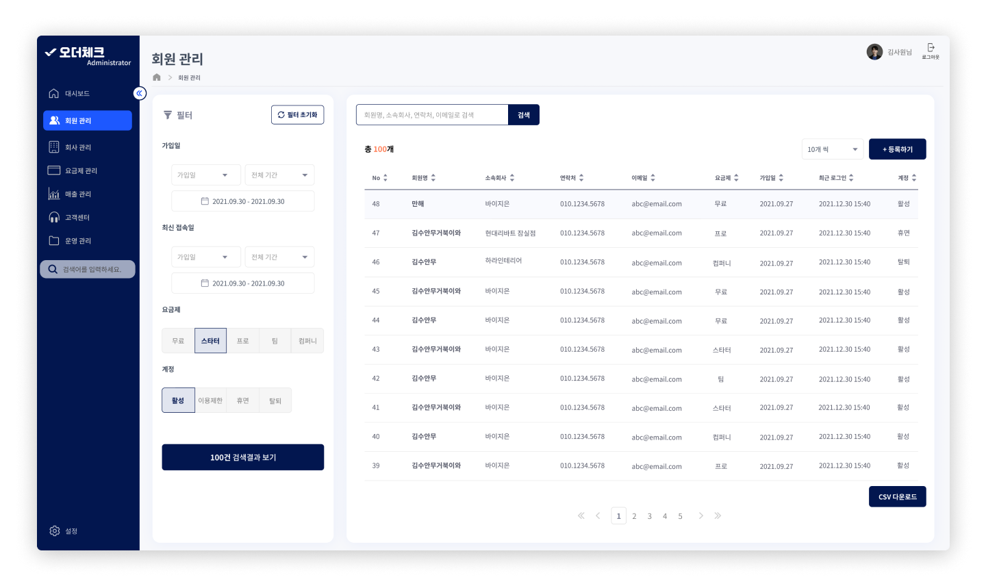
02
Table Restructure٭ necessary table fields added based on user research
٭ unnecessary fields removed based on user research
٭ sort feature added to each field

03
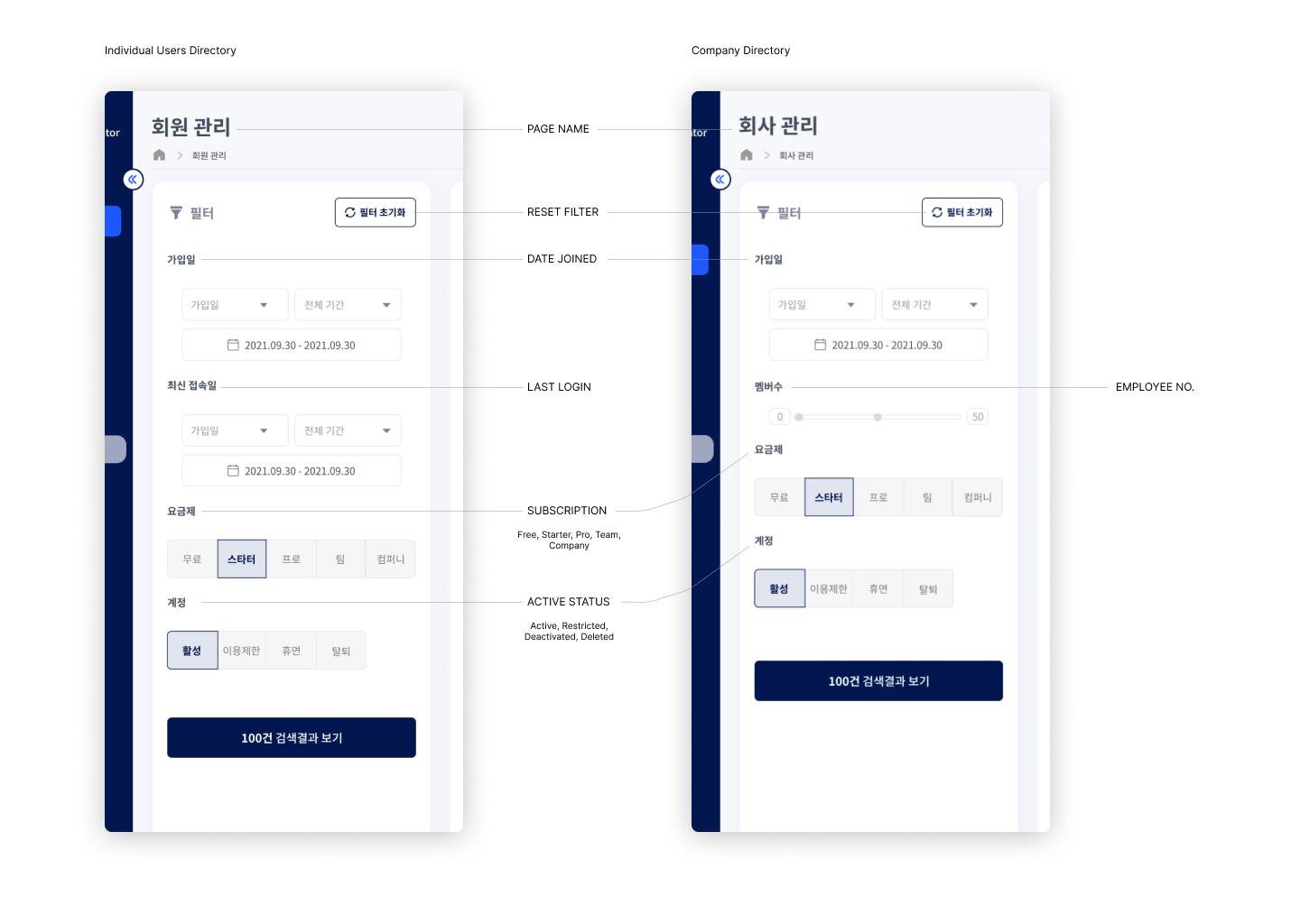
Filter ٭ for searches that are inbetween broad and specific
٭ focused on the key features provided by OrderCheck
Streamlined and Tangible Information Architecture
I focused on providing the ability to edit user information easily, ensuring that users can update their details without hassle. Additionally, I incorporated multiple navigation routes, allowing users to access certain pages through various links rather than being restricted to a single path. Recognizing that almost all users expressed the need for a straightforward learning curve when adapting to new features, I made the interface intuitive and easy to understand, reducing the time and effort required to become proficient with the system.

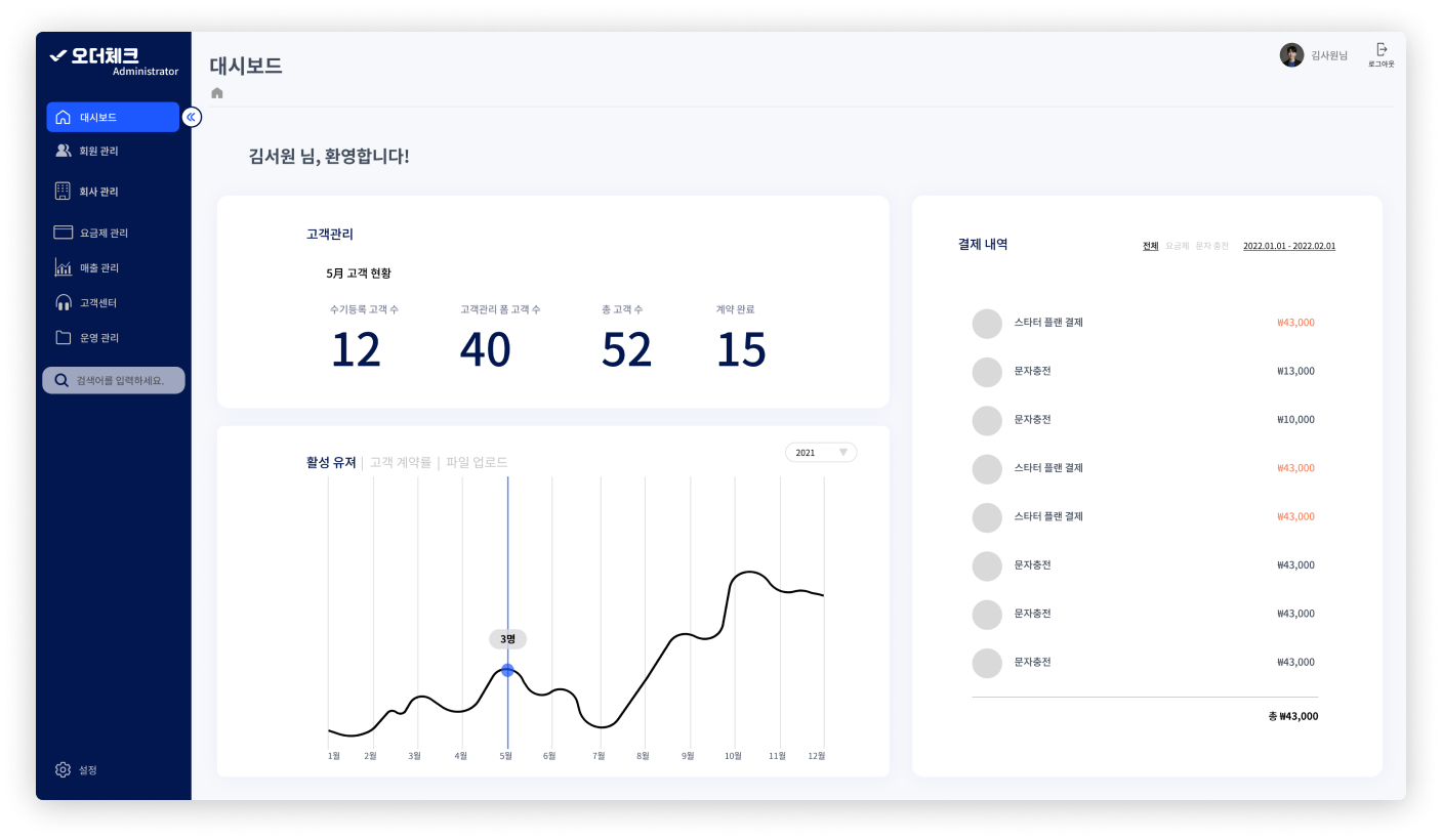
Tracking Company Growth
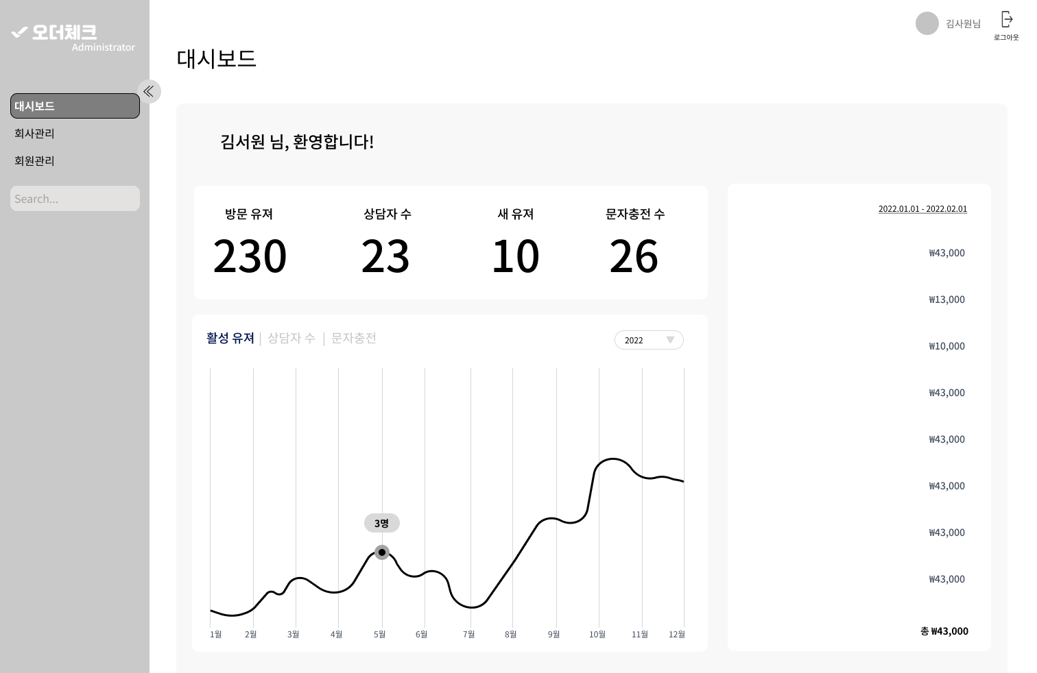
Considering the business and user problems, and recognizing that most users are not tech-savvy, we decided to create a dashboard focused on visual elements. The purpose of this dashboard is to provide a general overview of OrderCheck's growth and to ensure employees are aligned, rather than to conduct detailed analyses of user behavior. The KPIs were selected based on input from both the CEO and COO, as well as insights from user interviews. These KPIs focus on how users are engaging with each of the key features that OrderCheck offers.

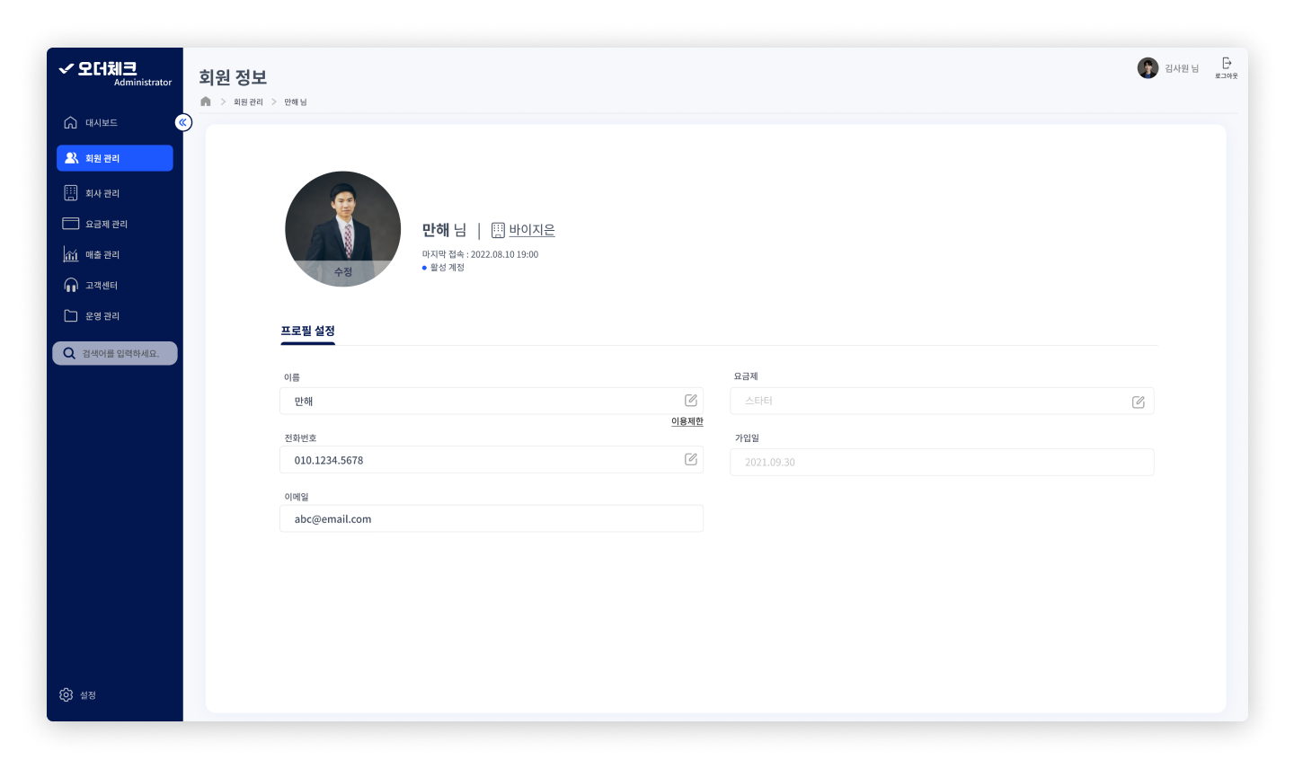
New Pages
Three additional pages were added in response to user needs.
01
User Specific Page٭ name, company, last active, and account activity are all placed next to the photo icon, as these informations do not need to be edited
٭ purpose of this page is to be able to edit personal information for users, as they often ask for help
٭ subscription status is removed, as it is based on the company’s subscription status, not the individual employee’s
٭ restrict user button is removed to avoid cluttering, as admins have never had to restrict any users


02
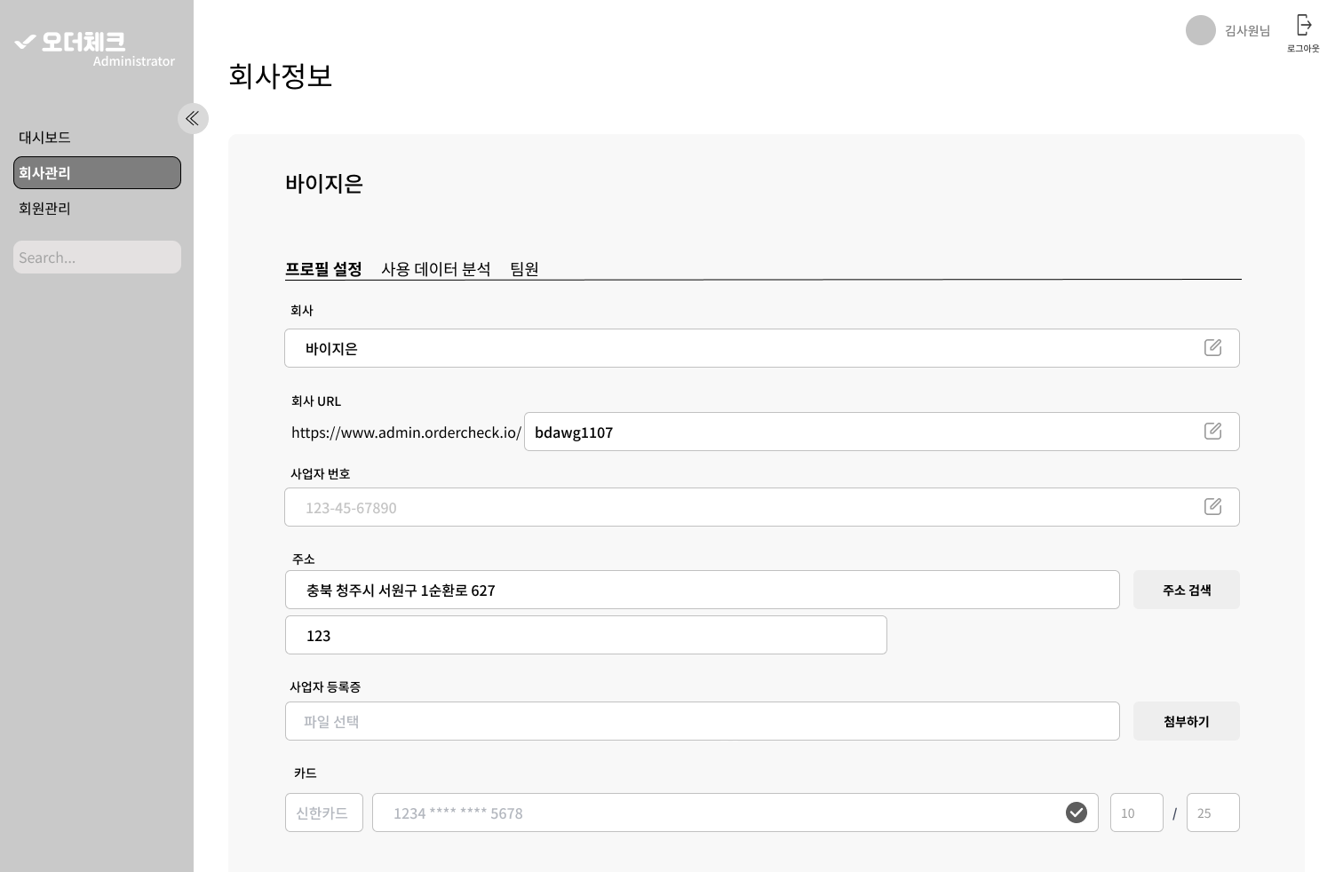
Company Specific Page٭ for editing OrderCheck client companies’ information
٭ contains all fields of the data table
٭ removed button options for sbuscription plan and account activity, as it is not used as much yet visually clutters space
٭ includes two sub-pages: company information page and employees
٭ the company data analytics page was initially added due to the suggestion of the CEO/COO. However, that does not align with user needs discovered from our research and would most likely be an unused feature, so I suggested to remove it.


03
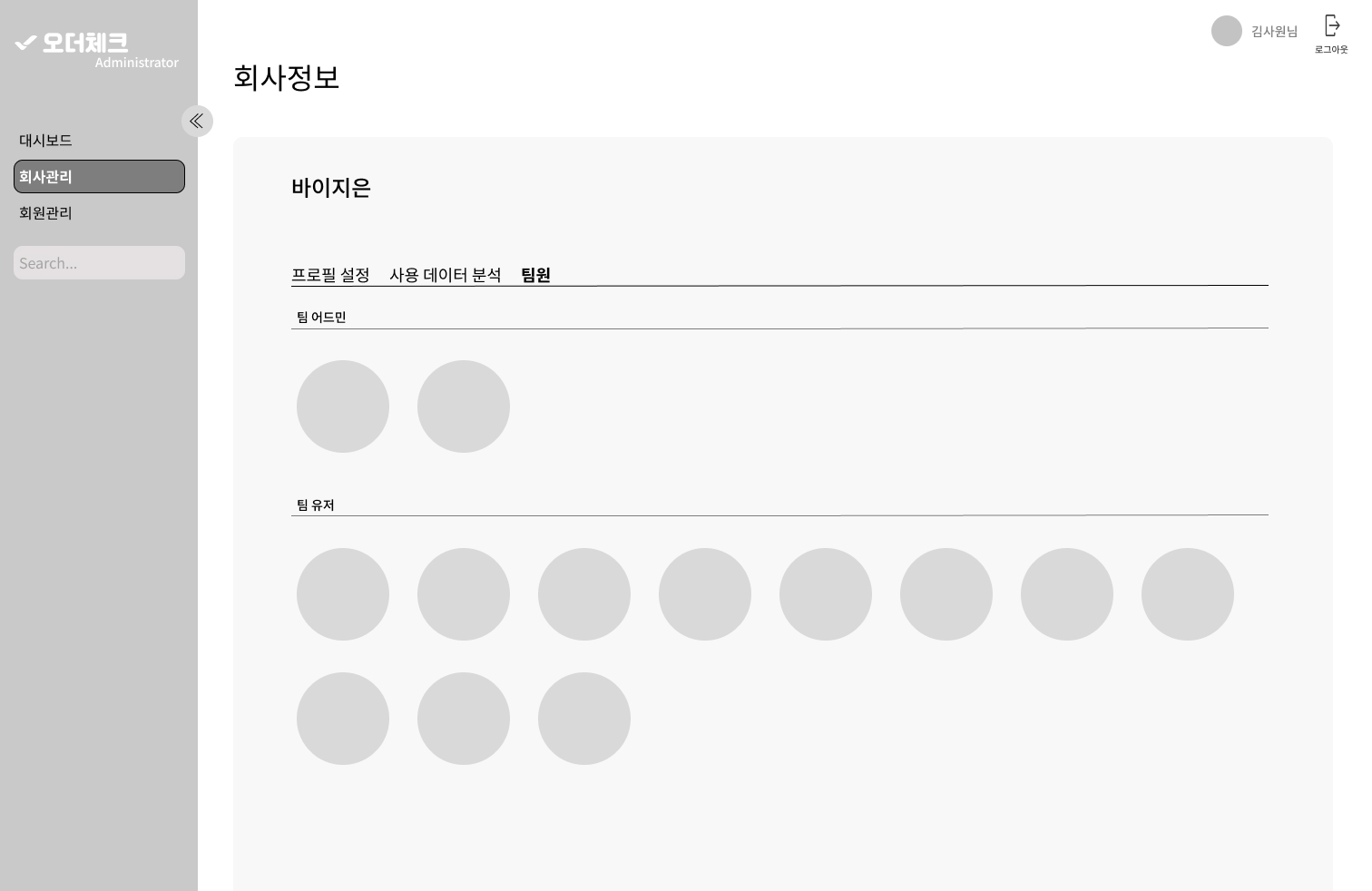
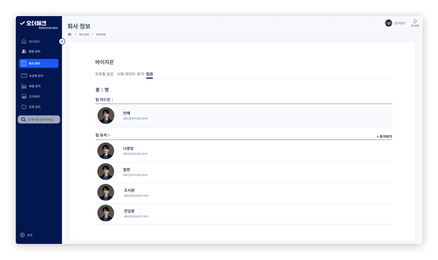
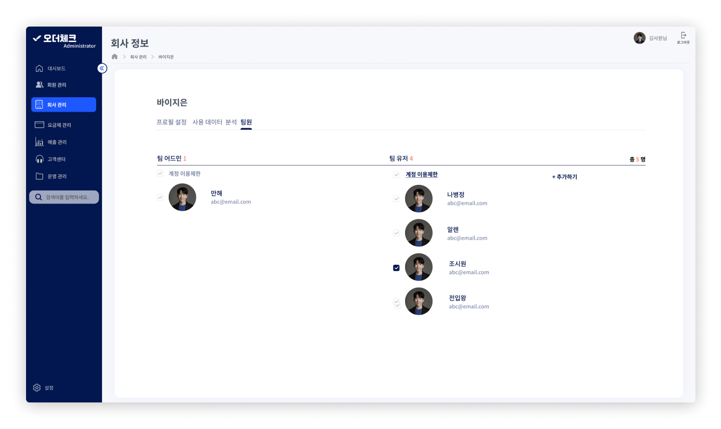
Employee Page٭ linked to the company specific page
٭ row darkens on hover
٭ list-style, as all of OrderCheck client companies have less than 10 employees registered under their accounts
٭ option to add new team members
٭ each profile is linked to user specific pages
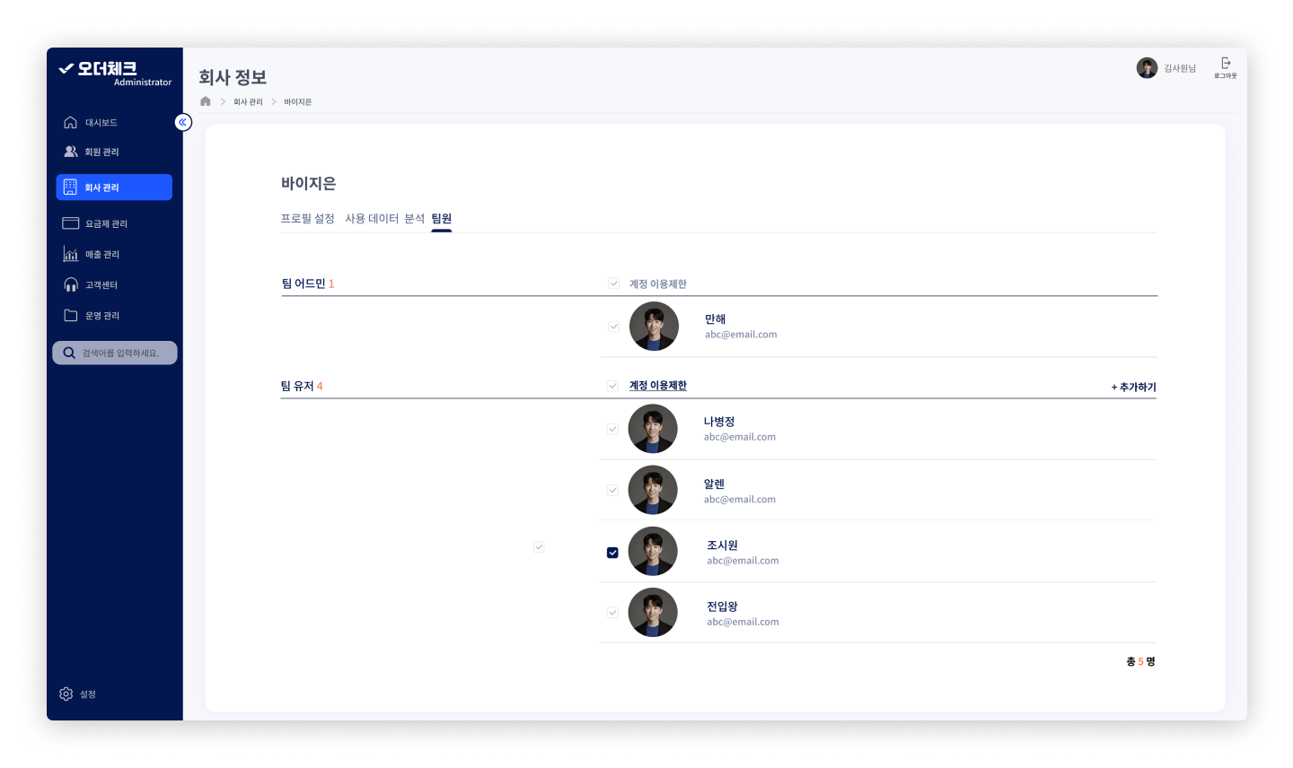
٭ checklist feature was to make restricting multiple users easier, but as OrderCheck has never restricted any users in the past, it is removed in the final design
Closing Thoughts
User Impact
based on user analytics from 3 months following the implementation of final designs✦ 87% increase in weekly admin portal usage
✦ 95% decrease in admin portal help requests made to the developers
✦ 100% faster customer service help
✦ 95% decrease in admin portal help requests made to the developers
✦ 100% faster customer service help
Reflection
✦ Communication is always an integral part, but especially at a fast-paced start-up environment
✦ Achieve balance between the company’s goal and users’ needs using data-driven judgement
✦ Learning to defend Design Decisions
✦ Achieve balance between the company’s goal and users’ needs using data-driven judgement
✦ Learning to defend Design Decisions
Next Steps
✦ Finish up the rest of the pages, following the visual guideline
✦ Continue periodically monitoring user behaviour on the admin portal to identify long-term problems
✦ Continue periodically monitoring user behaviour on the admin portal to identify long-term problems
🙌 you’ve made it to the end 🙌
return home
return home

